Written by Jorge Argota · Legal Conversion Optimization · United States
Most law firms accept a 3.8% to 7.4% form conversion rate because they assume “legal is hard.” The firms that break through that ceiling do it by rejecting the myth that shorter forms convert better. The problem isn’t form length; it’s the order of the questions. When your first field asks for a name and phone number, you trigger sales resistance before the prospect has any reason to trust you. Multi-step forms with the right sequence convert 86% higher than single-page forms and routinely deliver a 300% lift.
TL;DR
The sequence: start with a triage question (“What type of incident?”) not a name field. Users who engage with a first question are 86% more likely to finish. The architecture: multi-step forms convert 86% higher than single-page forms. 3 to 4 steps maximum with progress indicators. The close: “Get My Free Case Evaluation” converts higher than “Submit.” The recovery: 67% of legal clients hire the first firm to respond; 26% of firms don’t respond at all. Source: Jorge Argota, 10 years legal conversion optimization.
💡 The sequence flip in action
A Dallas criminal defense firm was running a 7 field single-page intake form that started with “First Name / Last Name / Phone Number.” They switched to a 3 step progressive sequence starting with “What are your charges?” as a tappable card selector. Form completion rate jumped 86% in the first 30 days and cost per lead dropped by $114 because the same ad spend was producing more qualified submissions without any increase in traffic.
WHY LEGAL WEBSITE FORMS FAIL AND HOW TO FIX THE SEQUENCE
People seeking legal help are operating under cognitive and emotional duress. Whether they’re facing criminal charges, navigating a divorce, or dealing with an injury, their working memory is already taxed. This causes “cognitive tunneling” where their field of attention narrows and any distraction (a complex menu, social media links, a 15 field form) triggers instant abandonment. To convert a stressed brain, you must build a slippery slope of micro-commitments where each step feels effortless and the next step feels inevitable.
The isolation rule: on the form page, remove the header navigation, footer links, and sidebar. The only clickable elements should be the form fields and the “Next” button. Every link that isn’t part of the conversion sequence is a leak point for attention that the stressed user cannot afford to lose.
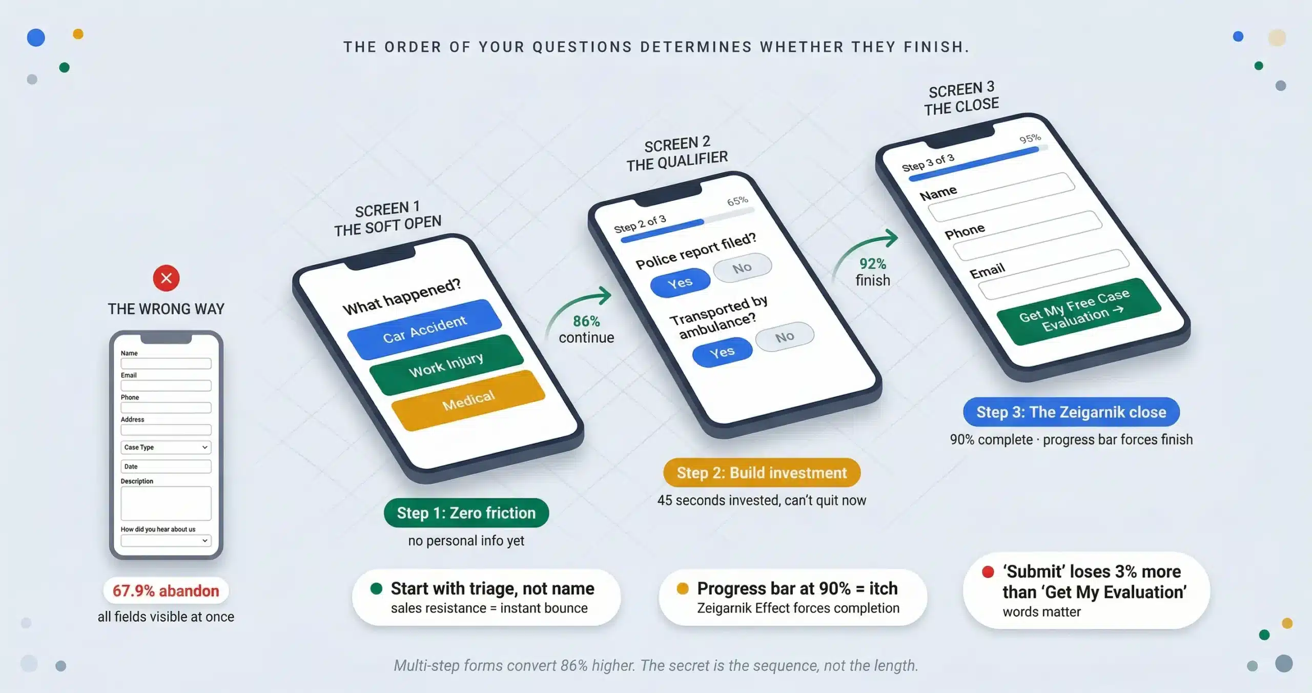
Step 1: The soft open (zero friction)
Never ask for a name or phone number first. That triggers sales resistance before you’ve earned any trust. Start with a high-relevance triage question: “What type of incident occurred?” with visual card selectors (Car, Work, Medical). This is the foot-in-the-door technique. Users who engage with that first question are 86% more likely to complete the form.
Step 2: The sunk cost qualifier
Place 2 to 3 case qualifier questions in the middle: “Was a police report filed?” “Were you transported by ambulance?” These signal expertise (you know what matters) and by the time the prospect reaches the contact field, they’ve invested 45 seconds. Abandoning now means wasting that effort. This filters tire-kickers and increases lead quality by 30%.
Step 3: The Zeigarnik close
The Zeigarnik Effect: people remember unfinished tasks 2x better than finished ones. A progress bar stuck at 90% creates a psychological itch that the user must scratch by completing the form. Frame the contact field not as a “submission” but as a receipt of value. Replace “Submit” with “Get My Free Case Evaluation.” The word “submit” has a 3% higher abandonment rate because it implies surrender, not reciprocity.
MULTI-STEP FORM ARCHITECTURE AND UX IMPLEMENTATION
Optimized multi-step forms convert 86% higher than single-page formats and routinely achieve a 300% lift over monolithic intake pages. This is counterintuitive: adding more steps increases completion. The mechanism is progressive disclosure. Single-page forms present all cognitive demands simultaneously, triggering decision fatigue. Multi-step forms show one logical cluster at a time so the initial interaction appears effortless.
The progress bar rule
Users are twice as likely to complete forms with visible progress indicators. Label the stages (“Step 2 of 4: Incident Details”) rather than using abstract percentages. If “10% complete” shows after 5 questions, the user will abandon. Keep it to 3 to 4 total steps.
Conditional logic (the “butler” model)
If they select “Car Accident,” never show medical malpractice questions. Conditional branching hides irrelevant fields so the form feels like a conversation, not a database. This “shortest path” approach means no prospect ever wastes attention on questions that don’t apply to their case.
The thumb zone mandate (Fitts’s Law)
60% of legal traffic is mobile. Place input fields and “Next” buttons in the bottom 30% of the screen where the thumb naturally rests. According to Fitts’s Law, moving the action button from the top-right (stretch zone) to the bottom-center reduces interaction time by 15% and error rates by 20% because it aligns with the thumb’s natural arc. Mobile abandonment runs 78% to 85% compared to 70% on desktop. Single-column layouts complete 15.4 seconds faster than multi-column.
THE SPEED TO LEAD PROTOCOL AND RECOVERY FLOWS
Most competitors stop at the “Thank You” page. The firms that break through the conversion ceiling treat the form submission as the beginning of the conversion process, not the end. 67% of legal clients hire the first firm to respond. 26% of firms don’t respond to leads at all. If you’re spending $150 per click on PI keywords and no one answers the phone for 5 hours, you’re subsidizing your competitors’ caseloads.
The 5 minute rule
Firms that respond within 5 minutes are 100x more likely to connect and 21x more likely to qualify the lead. Integrate the form with your CRM (Clio, Filevine) to trigger an instant automated text: “We received your details. An attorney is reviewing your case now.” This buys you time while signaling immediate attention.
The save and resume safety net
Mobile users get interrupted. Implement autosave that captures in-progress answers after 3 seconds of inactivity. If the user drops at Step 3, you already have their name and email from Step 1. Offer a “Save Progress” link that emails them a resume URL. This recovers 19% of abandoned users. Only 20% return organically without it. Compliance note: add micro-copy stating “Progress saved automatically so you don’t lose your place” to ensure GDPR and CCPA compliance on the partial data capture.
⚠ The field bottleneck audit
Knowing your form has a 20% conversion rate is not diagnostic enough. Deploy field-level analytics tools (Hotjar, CrazyEgg, or Gravity Forms analytics) to track step completion rates (where exactly do they drop), time-on-field metrics (if a user stares at a field for 45 seconds, the question is ambiguous), and hesitation rates (typing, deleting, retyping means confused formatting requirements). If 40% of users drop at the phone number field, move it to the end. Continuous testing driven by these analytics reduces abandonment by 34.8% on average. Bot defense: multi-step forms attract spam bots that inflate your CRM data. Deploy invisible reCAPTCHA v3 or honeypot fields (a form field visible only to bots) to filter automated submissions without adding friction for real users.
LEGAL FORM CONVERSION FAQ
Get Your Form Conversion Audit
I’ll run field-level analytics on your current intake form, identify the exact step where prospects are dropping, and rebuild the sequence using the triage-qualifier-close architecture that turns a 67.9% abandonment rate into an 86% completion lift.
About Jorge Argota · 10 years optimizing legal intake funnels. Every form I build uses the triage-qualifier-close sequence with field-level analytics and autosave recovery. Full bio.
Related: Intake Process · Website Design · Conversion Optimization · Cost Per Signed Case · SEO vs PPC ROI